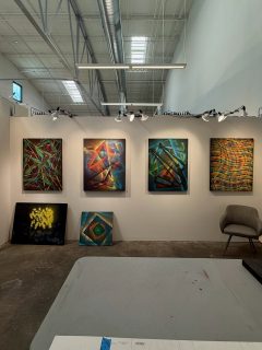
I try to make interesting and meaningful art despite having deuteranomaly, or defective red-green color vision. I don’t think about my disability obsessively, but I know these color deficiencies affect my artistic choices. And I know I cannot see some of my art the same way you do.
Color blindness is a recessive genetic trait on the X chromosome. That’s why it is much more common in men (8% of men have some type of color blindness but only 0.5% of women).
I realized something was wrong with my color vision around fifth grade, when we had a screening at school and I struggled to identify numbers in fields of dots. Through my school years I occasionally put together a comical ensemble, based on the reactions of my peers.
But it wasn’t until I applied for my student pilot’s license and flight medical, when I was 18, that I realized how color deficient I was. At first my flying was restricted to daytime only, but I was able to pass a practical test and have that restriction lifted.
A few years ago I purchased sunglasses from EnChroma, which specializes in glasses that enhance color vision by filtering out frequencies that people like me can’t see distinctly. I later purchased a version for indoor use, which are less effective.
They are interesting to wear, as they really make reds and greens pop wonderfully. But I don’t find them very useful in my work. I still can’t see things exactly as others do.
Colorful Collage Art
So, my art is very colorful. Maybe more colorful than I know!
One notable piece, The Pleasure Park, is dominated by green, but I know it is even more green to other people than I can perceive.
In general I am more comfortable working in blues and yellows, in pieces such as Striations in the Western Sky. You see a lot of blue and yellow and gold in my work, as I often create from prints of sea and sky. In fact, it may be that people with deuteranomaly have enhanced perception of blues and yellows.
Many artists with color deficiencies are very successful. Peter Milton is a well-known artist with the same type of color deficiency I have.
Edgar Degas is believed to have had color blindness, as did the poet and painter William Blake. Claude Monet may have developed color problems late in life, although that is more akin to Beethoven becoming deaf. Some have questioned Van Gogh’s color vision as well, as he also used intense blues and yellows.
I love creating new pieces, and if they look good to me, I hope they do to you also. This past month I completed three new works.
Rites of Passage
This new piece uses lots of color (red and green included) and is reminiscent of my botanically oriented work from a few years back. I am always trying to create a sense of motion and depth and it’s always a thrill when the last strip is in place and the piece comes alive. This one did, for me.
Stepping Stones
This one came alive as well, when I added the torn pieces that seem to float over the background.
The background comes from photos of my recent collage, Skyscape, which I printed and crumpled and soaked in water and rephotographed and filtered to bring out some startling purple (which I see well) and green (which was unintended, but I left in). Sometimes I use material like this in a way similar to classical composers, who often reused bits of their music in multiple works in ways that are sometimes less obvious than others. And it’s also similar to how contemporary pop or rap music uses samples of older pieces.
It looks ok to me. How about you? Do the “stones” float?
Time Interrupted
There is no “right” way up for this piece, which uses a minimum of color in a field of white/silver/gray/black. It can be hung from any side. But I do like it this way, towering up.
The background comes from a photo of a ventilation grate in Washington DC. I am always on the lookout for interesting material, and this caught my eye as I was recently waiting on an Uber. I planned on using it as part of another piece, but then the grate photo took over, as sometimes happens. And I went with it.
There are four layers of material here, matched to the underlying grid, which provides the unifying effect and pull towards the middle of the piece. The layers add another hint of depth as one looks into the collage, which has a strong sense of dimension.
Wishing you a Good Summer
We are well into summer, each now likely to be hotter than the one before. Stay cool and safe. I hope to have some more works to share in August.


